Brand positioningBrand identityMarketing materialsVideo productionPhotographyWeb design and development
The challenge
Sports nutrition is one of the loudest categories in consumer branding. Whey protein brands tend to look the same: aggressive type, hyper-masculine imagery, and language about gains and beast mode. Every brand shouts the same thing, and people have stopped hearing it.
The Boring People entered with a name that broke the rules. A protein brand calling itself “boring” is a knowing wink, but a clever name only works if the brand behind it delivers on the joke.
Make a brand called “boring” look like the most alive thing in the category.
The strategy
The contradiction is the point
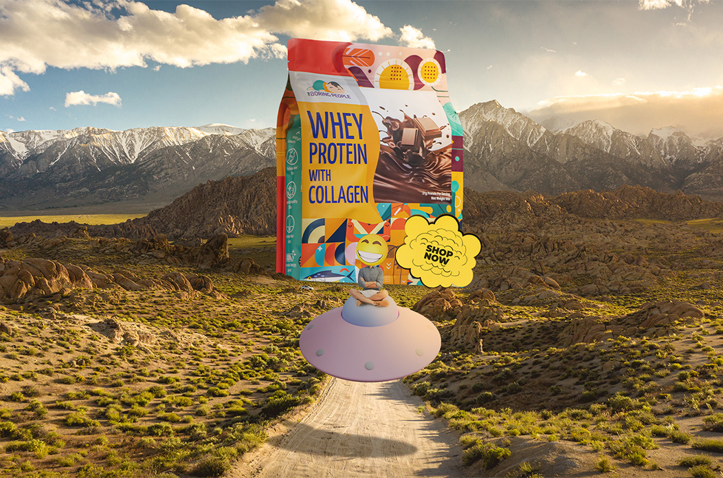
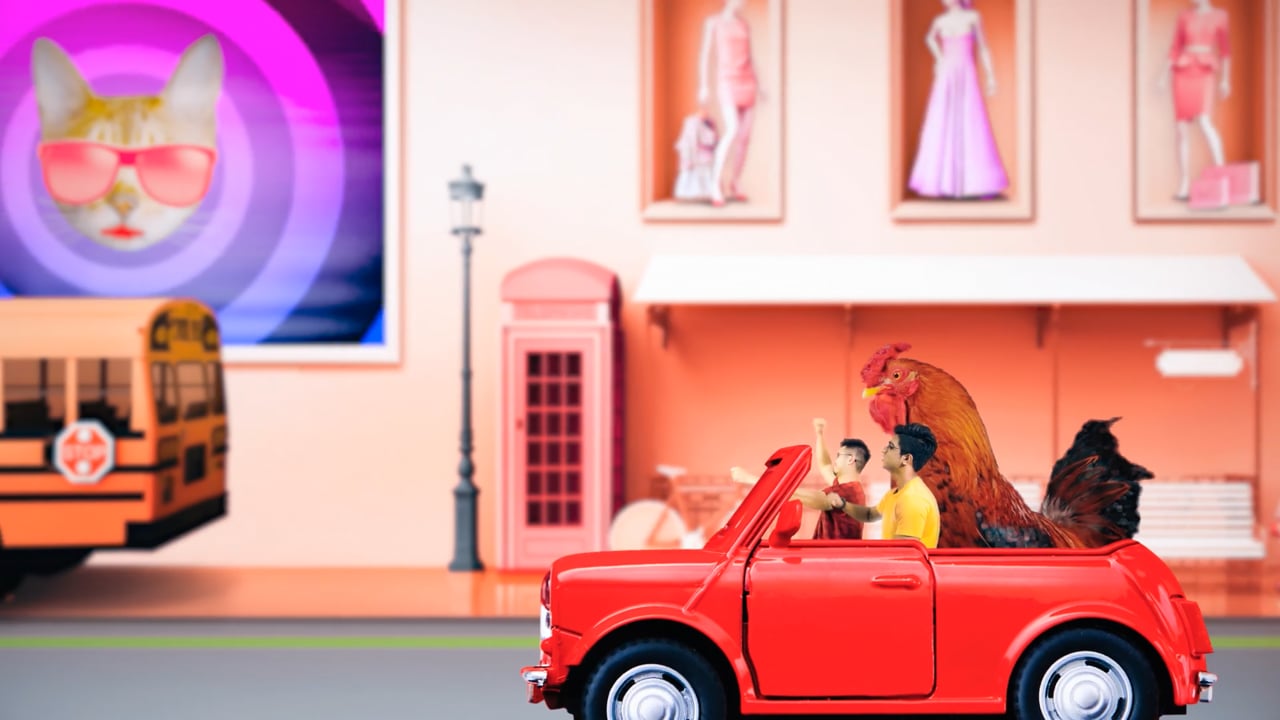
The name says boring. Everything else says the opposite. People read “The Boring People”, expect something dull, then meet a world so colourful and surreal that the joke lands straight away.
Where the category goes dark, aggressive and masculine, The Boring People goes bright, playful and dreamlike, for a younger audience tired of being shouted at.
Brand positioning
Who the brand is for, what it stands for, and how the ironic name becomes a real brand idea rather than a one-off gag.
Brand identity
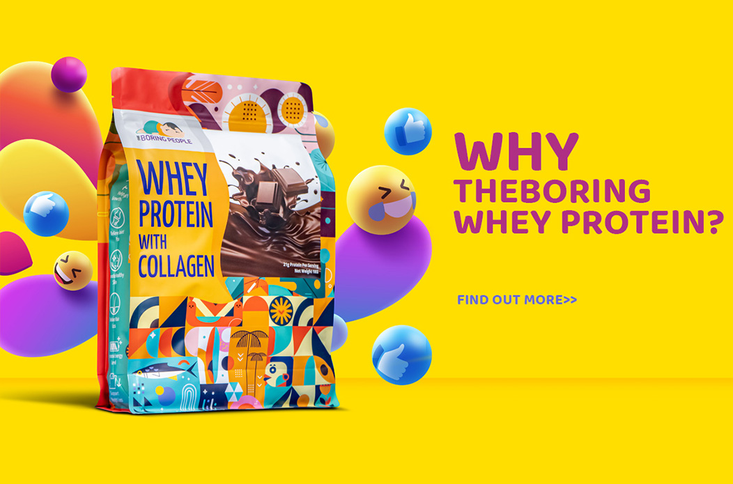
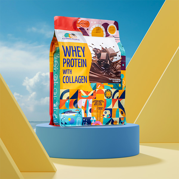
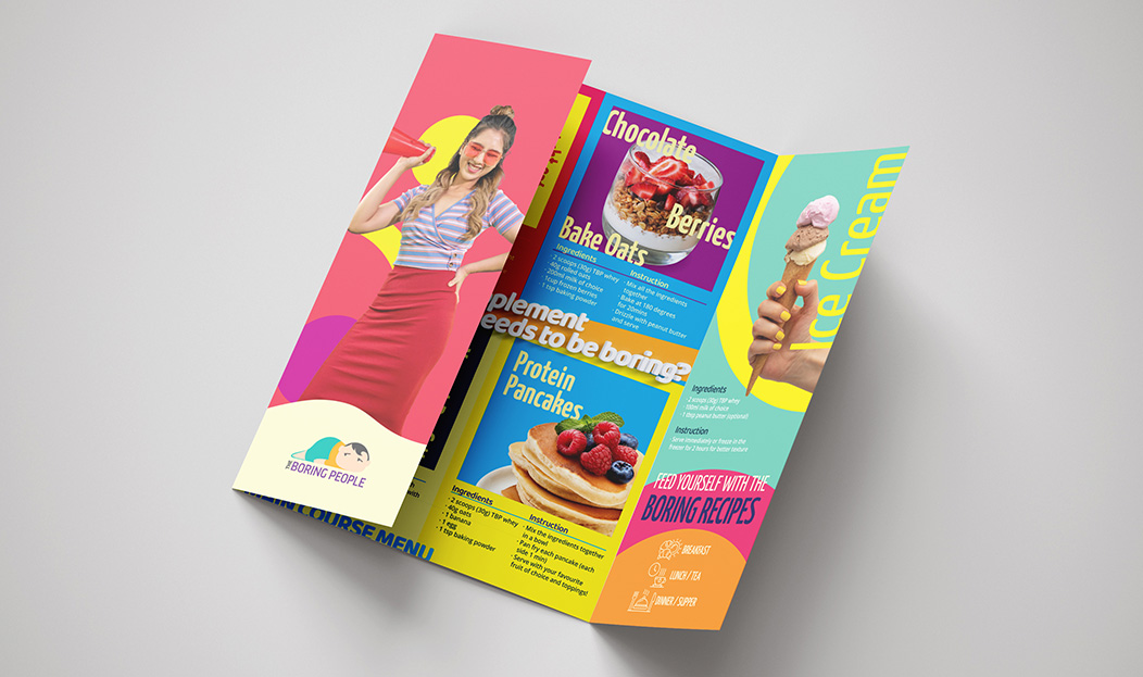
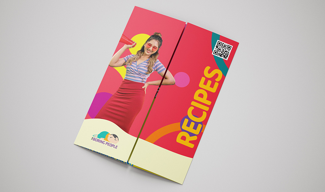
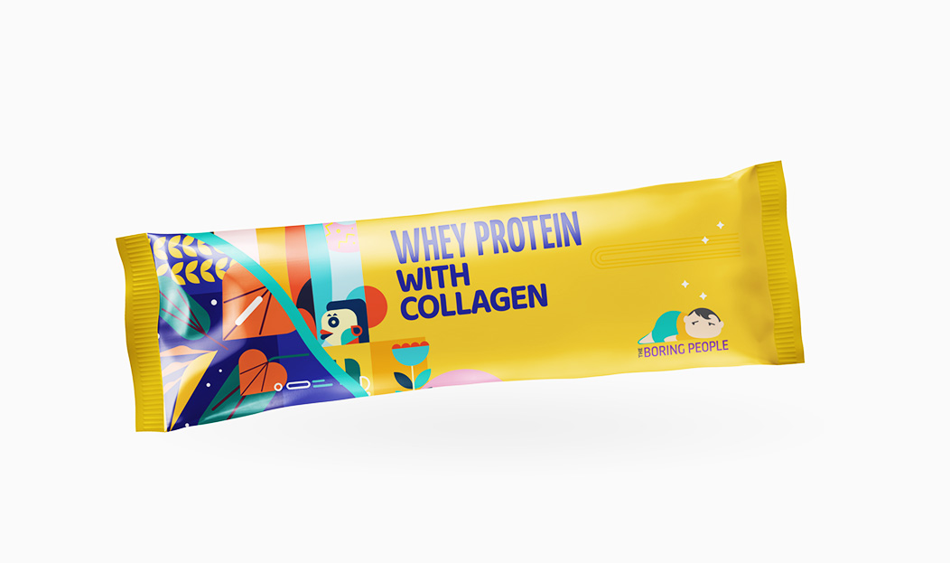
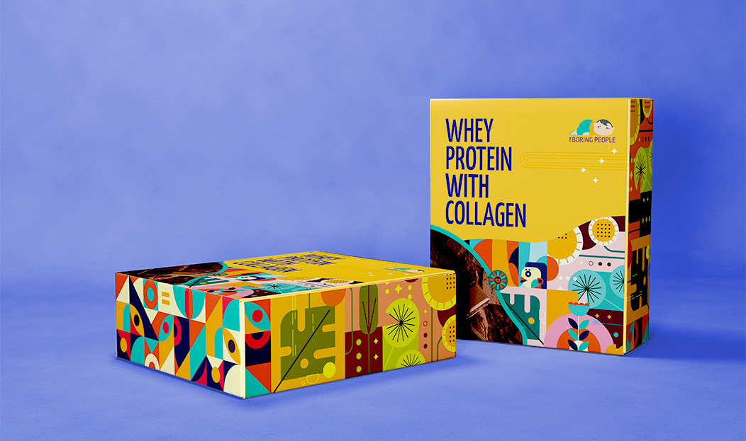
Logo, typography, colour and the surreal world that runs through everything.
Marketing materials
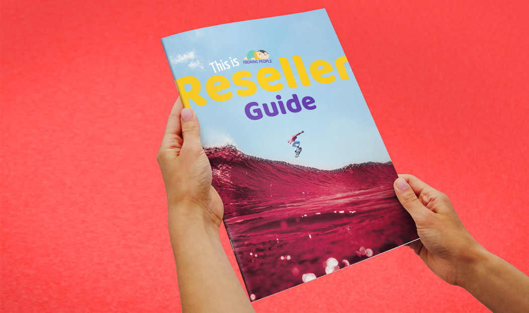
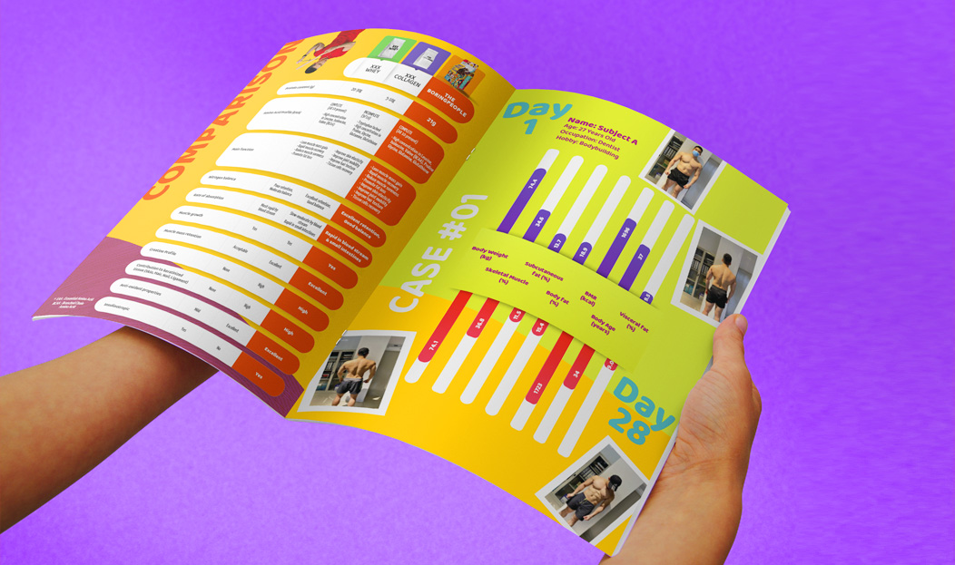
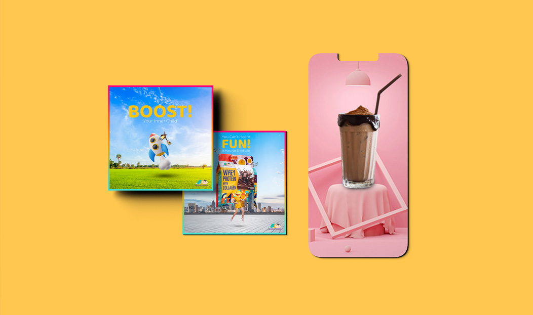
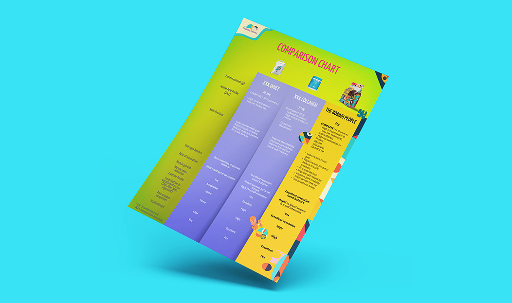
A full kit across digital and print, all in the same bold, surreal language.
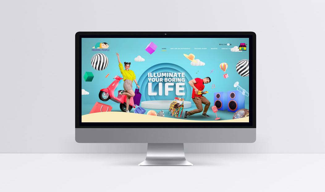
Web design and development
A digital home that delivers the brand world online and supports the product range.
Promotional video
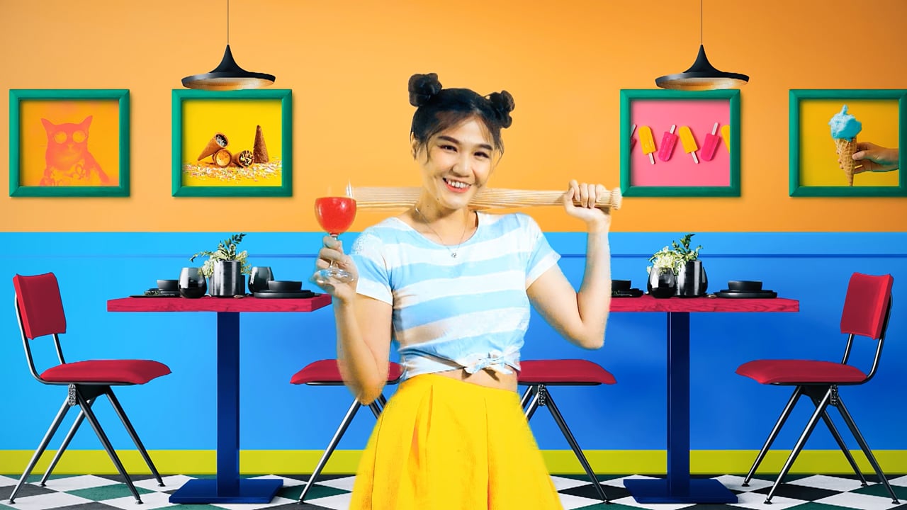
The surreal world in motion: energetic, colourful, and strange in the best way, made for social.
The world of Boring
In motion
The films
Anything But Boring
2 Videos
The outcome
Unmistakable from day one
The Boring People launched as the brand that didn’t look like any of its competitors. Where the category shouts, the brand winks.
In a crowded space where most brands are interchangeable, the work gave a new brand a distinctive identity that stops the scroll.