From Sea and Forest
- Client
- La Gele
- Industry
- Beauty supplements
- What we did
- Brand positioningMarketing materialsVideo productionPhotographyWeb design and development
The challenge
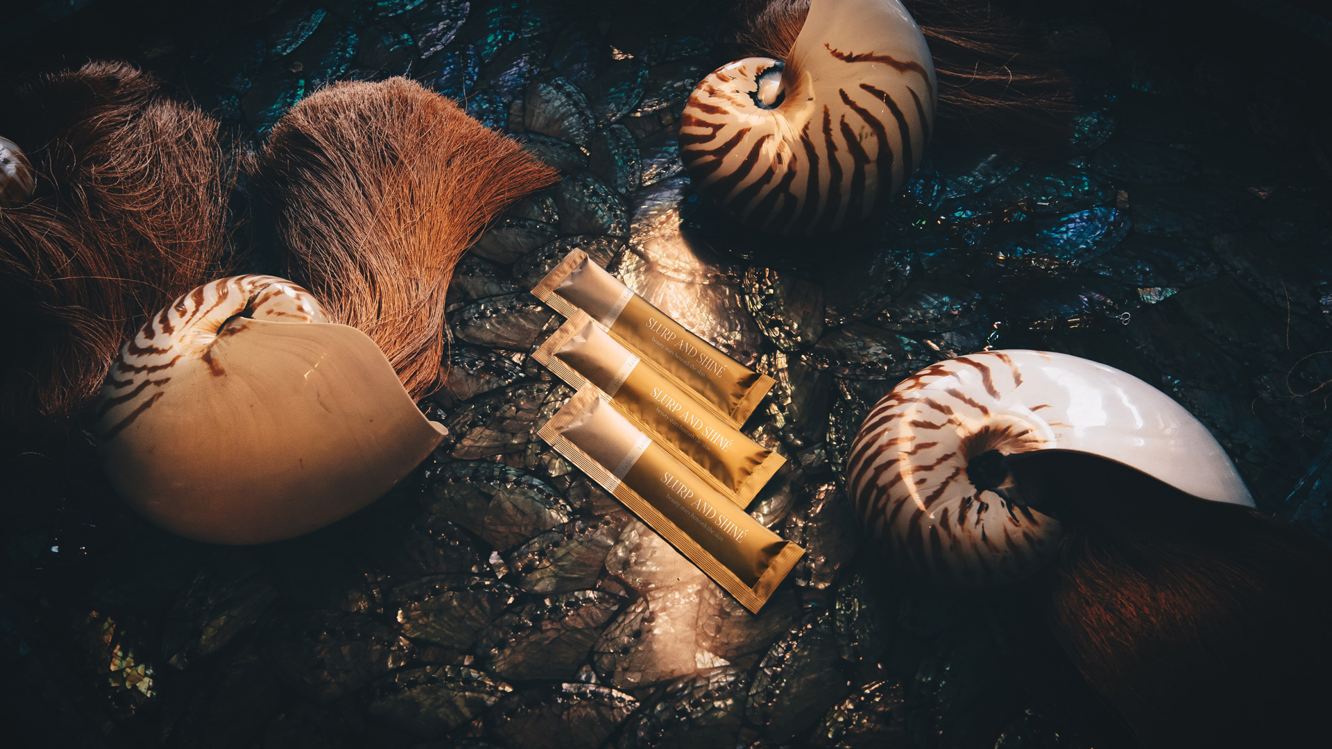
Beauty supplements are thick with claims: radiance, collagen, glow. Most brands promise the same change and look the same doing it, with soft pinks, clinical whites and stock images of perfect skin.
La Gele had a real difference: ingredients from the sea and the forest, at the premium end of the category. The brand needed to look as considered as that: premium without being clinical, natural without being rustic, and feminine without falling back on soft pink.
Make “beauty from sea and forest” feel like a place, not a tagline.
The strategy
Two natural realms
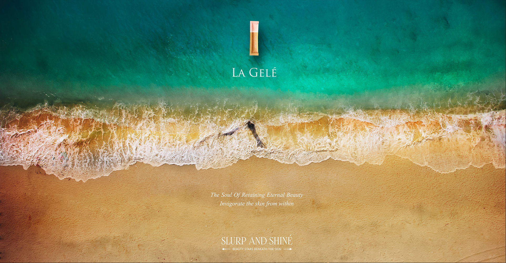
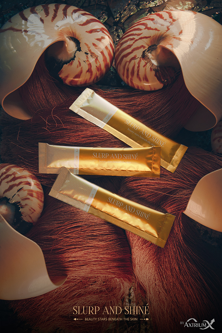
The sea and the forest are two distinct worlds: the depth and mineral richness of the ocean, and the lushness and life of the forest. We made them the visual and emotional base of the whole brand.
Rich greens, deep natural tones and gold accents signal luxury without shouting. The positioning: botanical luxury for women who want their supplement to feel as premium as the rest of their routine.
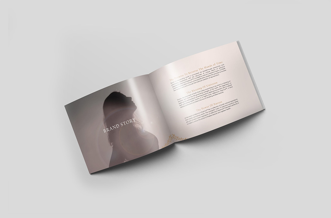
Brand positioning
Who La Gele is for, what it stands for, and how the sea-and-forest story becomes a brand worth choosing.
Photography
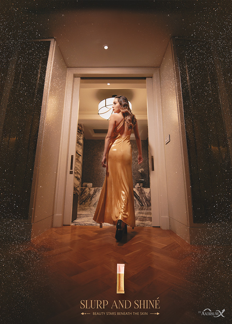
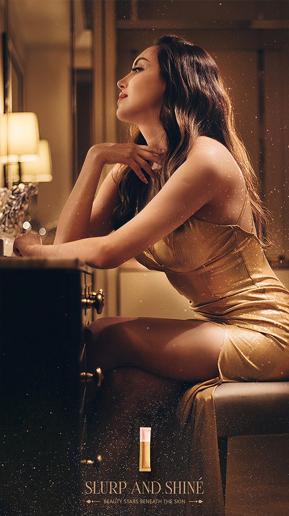
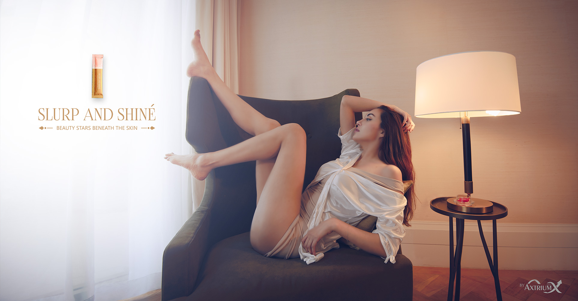
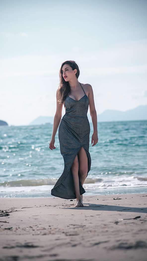
In beauty, photography is the brand. Product shots and commercial imagery that build the sea-and-forest world.
Video
The textures of sea and forest in motion, made for the brand’s digital and social channels.
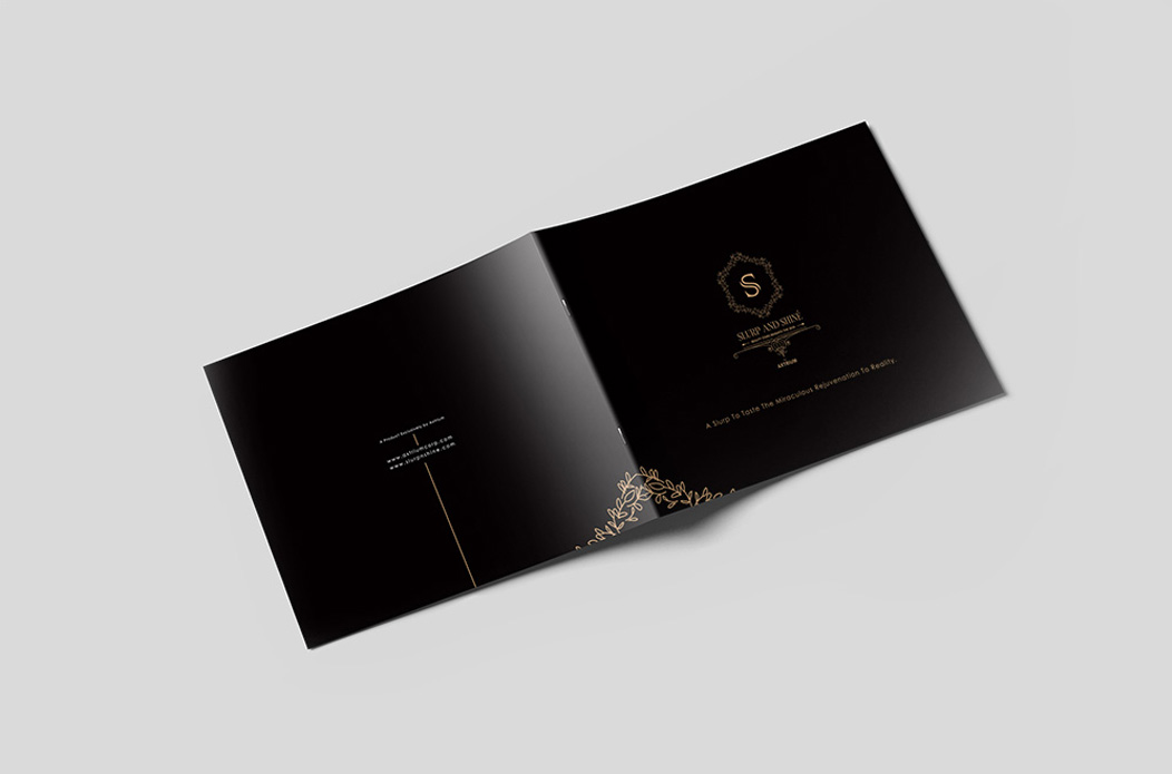
Marketing materials
A full kit across digital and print in the same botanical luxury language.
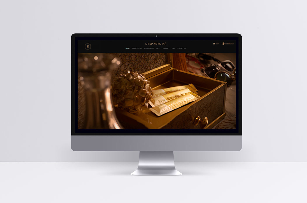
Web design and development
A site that presents the product as premium and feels as considered as the brand.
Sea and forest

In motion
The films
From Sea and Forest
The outcome
Unlike anything on the shelf
La Gele launched with a brand that doesn’t look like its competitors. Where the category defaults to clinical whites and soft pinks, La Gele draws its premium from the sea and the forest.
It gave a new brand a distinctive premium identity that justifies its positioning at first glance.
