Right now, two websites share our desk. They’re for sister brands in finance, and we’re deep in the UI and UX design for both: layouts, page flows and a lot of prototype rounds.
Two sister brands, one family look
PFP Capital Hong Kong works with professional investors. PFP Financial Singapore gives financial advice to individuals, families and businesses. We’re designing both side by side, so they feel related, while each site speaks to its own people.
Every word gets checked
In finance, every single word on a website needs approval, often from different levels in the company. So we mark clearly which copy came from the client and which we proposed. That way their reviewers know exactly what to look at.
A guide with every prototype
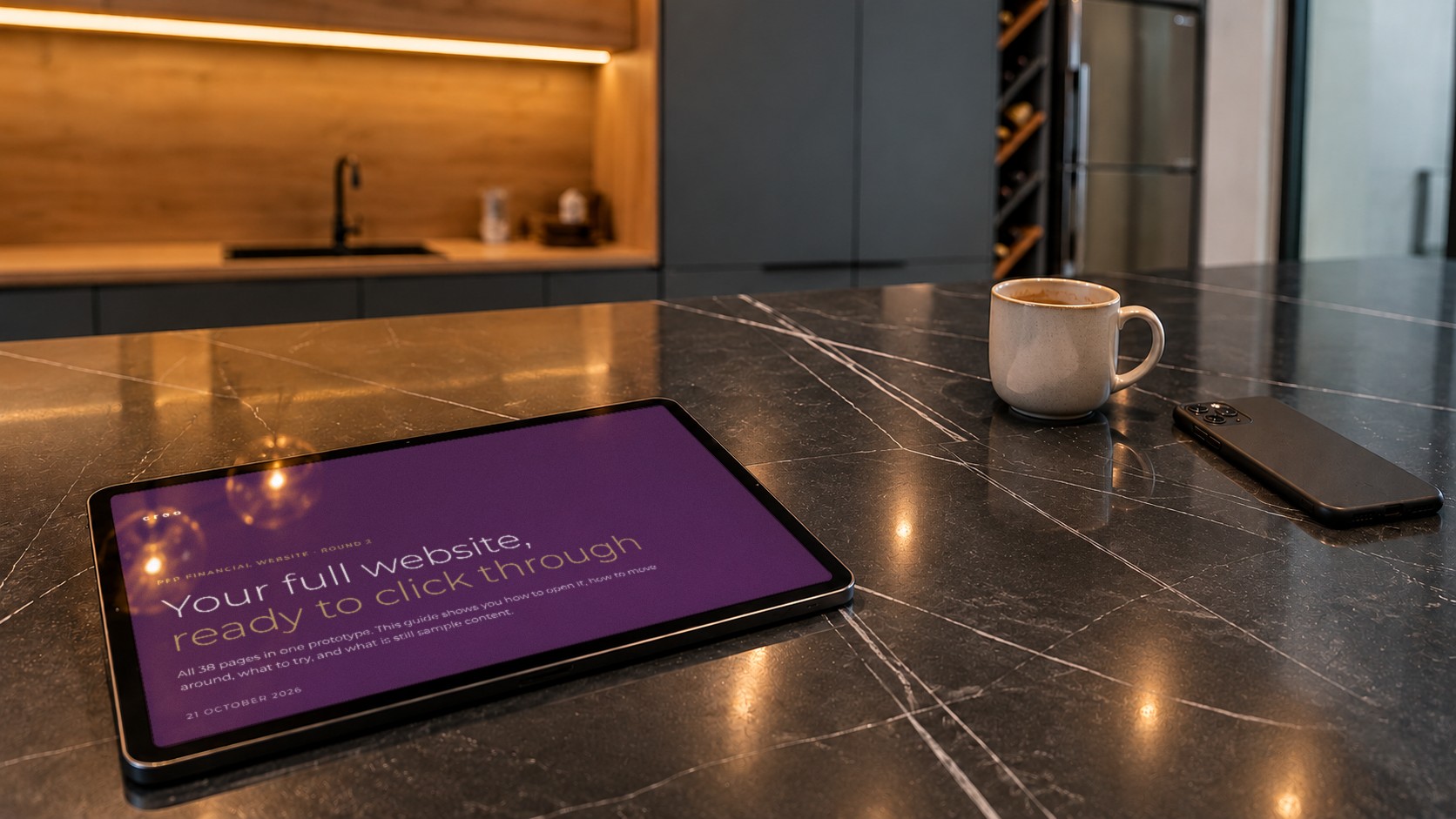
Each time we share an updated prototype, a short guide goes with it: how to move around the prototype, what’s done since the last round, and what still needs their feedback. That way nobody has to guess where to click or what’s changed.
Every time we share an updated prototype, we send a navigation guide with it. We make it clear what’s done and what needs their feedback.
Danny
A checklist for their team
We also give them a checklist, so their internal team can check the site page by page without missing anything. It’s a small thing, but the client noticed. They told us we’re great to work with, because we always make their work easier.
Fewer boxes, more space
On the design side, PFP Financial Singapore asked for a cleaner look with less of a boxed-in feel. So we kept one background colour and used space between sections to show where one ends and the next begins. The page feels calmer, and the sections are still easy to tell apart.
We’ll share more as the two sites take shape. Meanwhile, here’s some of our other work and what we do.